Premium DTC ecommerce · Rémy Cointreau
Nine years shaping one of Scotland’s most independent distillery brands at Bruichladdich.
Designing and producing the digital experience for Bruichladdich, Port Charlotte and Octomore across two platform migrations and a roughly tenfold increase in direct sales.
01 / The brief
An Islay renegade, globally amplified.
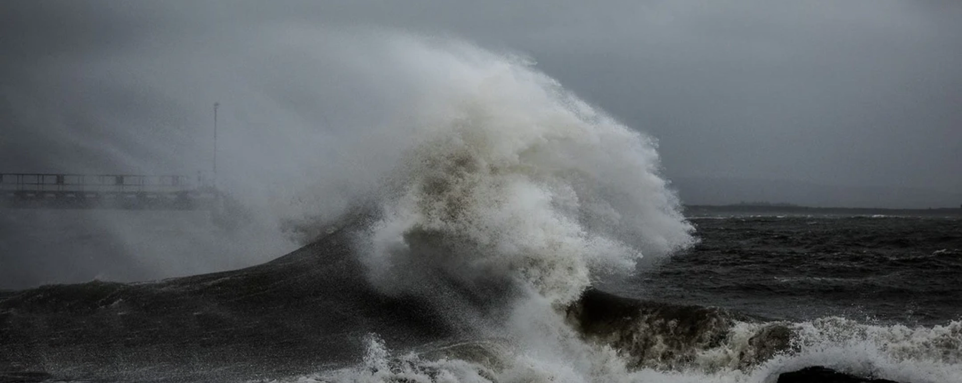
Bruichladdich distillery was brought back to life in 2001 by Mark Reynier and a small consortium, refusing chill-filtration and added colouring, championing Islay-grown barley, and putting itself publicly at odds with Scotch whisky orthodoxy.
Twenty-five years on, the distillery is the first in Europe to be certified B Corp, and its three brands (Bruichladdich unpeated, Port Charlotte heavily peated, and Octomore, the world’s most heavily peated single malt) sell directly to customers worldwide.
02 / What needed solving
Outgrowing the platform — twice.
I joined Bruichladdich in 2015. The site was on Drupal Commerce. It worked, but it could not keep up. The range was expanding, the audience going global, each release straining the architecture further. I led a ground-up rebuild on WordPress and WooCommerce.
When Rémy Cointreau mandated Shopify Plus across the group, the brief became a second rebuild. I used this opportunity to bring together a proper design system spanning all three whisky brands. An external agency built the custom theme to my token specification, and a team of international developers handled backend integration.
03 / Provenance as commerce
Geographical maps are part of the buying journey.
Most premium whisky brands tell their story in tasting notes. Bruichladdich’s story is geographic. The site needed to make that legible at the point of purchase.
I designed a system of interactive 3D maps, embedded on product pages, which let customers trace the grain in a specific bottle back to the field it came from. The first maps were built for the Islay Barley range. As sourcing extended to Scottish mainland organic barley and Orkney bere barley, the system extended with it. The shared specification meant each new map was a content task, not a redesign.
04 / No Hidden Measures
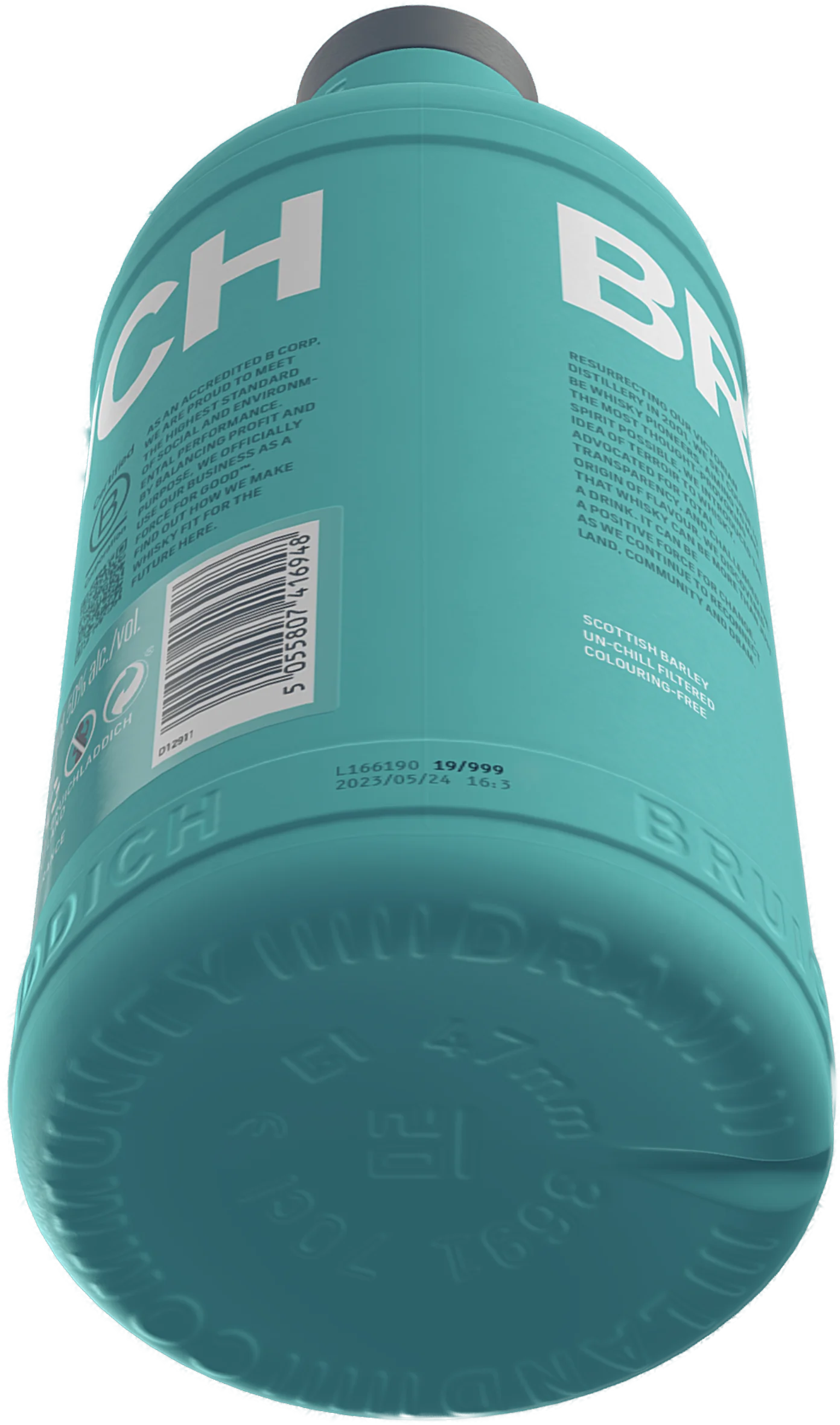
Every batch of Classic Laddie has its own recipe.
Scotch whisky is one of the most regulated drinks categories in the world. Distilleries are legally constrained in how much detail they can publish about a specific bottle’s recipe, cask programme, or batch composition. The default for the category is partial disclosure: tasting notes and broad provenance, with the actual recipe staying inside the distillery.
Bruichladdich’s position was that the customer should have the right to know. The legal constraint was that the brand could not publish this information unprompted. The design response was No Hidden Measures: a feature where a customer enters their bottle’s unique batch code and the page returns the exact recipe for that bottle — the casks used, the barley origins, the distillation years, the maturation profile, and a custom radar chart drawn for that specific batch.
Redacted by law
The customer is not given the information. They earn it by holding the bottle.
Every Classic Laddie batch since launch has its own recipe in the system, varying across vintages, barley provenance and cask composition. Where SWA rules prevent disclosure of distillation years on individual cask entries, the table shows a deliberate redaction block rather than hiding the field. Transparency about the limits of transparency, treated as a brand position.
I designed the input UX, the reveal animation, the recipe page layout, and the radar chart. An external developer handled the data pipeline. Live since 2017.
05 / Designing the tin out
One tin lighter.
In May 2020 Bruichladdich became the first Scotch whisky and gin distillery in Europe to achieve B Corp certification, with an inaugural impact score of 81.2. The certification structured the sustainability programme into four pillars: Energy and Emissions, Agriculture and Biodiversity, Packaging and Waste, and Islay and Community. By 2023 the score had risen to 100.7.
The One Tin Lighter initiative sat under the Packaging pillar. It was the most visible commerce expression of the wider programme.
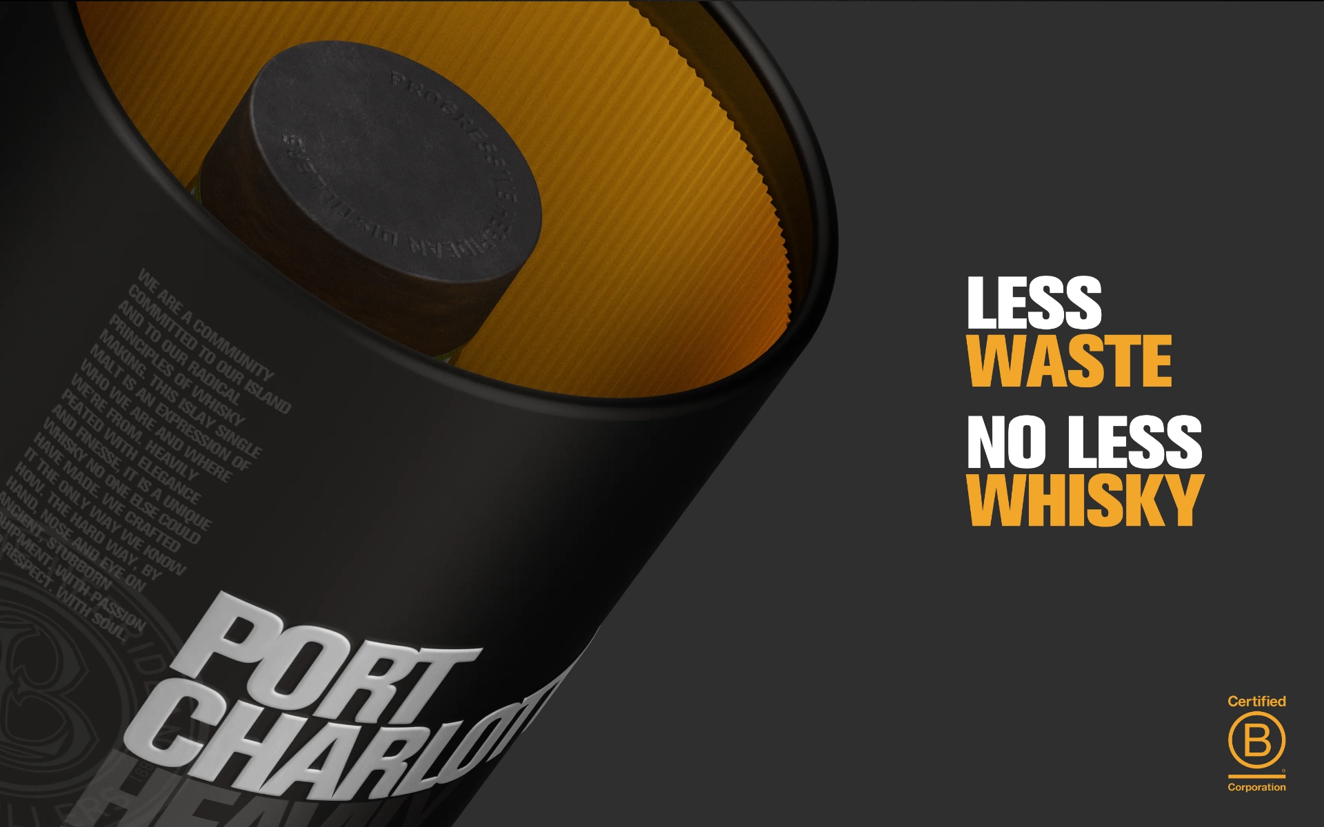
Is there a whisky presentation complex?
Premium single malt had always come in an outer presentation tin.
The tin generated over a kilogram of CO2 per unit, added shipping weight, and cut bottles per pallet. The whisky was the product; the tin was an accessory. In early 2021 the logic was reconfigured. No-tin started to become the default. Customers had to deliberately select to include a tin, rather than to remove it.
The design problem was tonal. A green badge or eco label on the no-tin option would have made the decision feel like a moral test. I designed the toggle as a single equal-weight binary. The Less Waste, No Less Whisky position was carried in surrounding editorial, not at the point of purchase. The work later moved past customer choice altogether. The Classic Laddie was redesigned without an outer tin, in a lighter recycled-glass bottle. Total packaging CO2 fell 65%. Port Charlotte followed. The toggle remained on Octomore and certain limited releases where the tin was part of the presentation.
06 / Where Sketchfab hit its limit
A new system view
For premium whisky, the bottle is part of the product. Label finishes, glass colour, foil weight, closure, proportions: these are the things a customer in a shop would pick up to examine. Photography cannot fully substitute. At DTC price points above £100 a bottle, that is a real gap.
I designed a system of 3D bottle viewers, one per brand, hosted on Sketchfab and intended for embed on product pages. The three shown here are the opaque-glass releases, which rendered cleanly. The system did not ship. Sketchfab’s post-processing could not render amber liquid behind transparent glass convincingly enough for the brand. A viewer system that worked on opaque bottles but failed on transparent ones could not launch as a partial rollout.
The system was built and not deployed. WebGL renders refraction through a single transparent object well, but cannot refract one transparent object through another: liquid behind glass cannot be made to look convincing under the current rendering technology. The transition to WebGPU is what changes that.
07 / Editorial and community
Newsletters, news, and the Laddie crew.
Bruichladdich’s customers are not just buyers; they identify as the Laddie crew. Newsletter signup is the conversion event that matters most to long-term value, so it had to feel like an invitation, not a popup. The mobile-first signup sits over editorial imagery, with copy that addresses the visitor as a peer.
08 / Working inside the rules
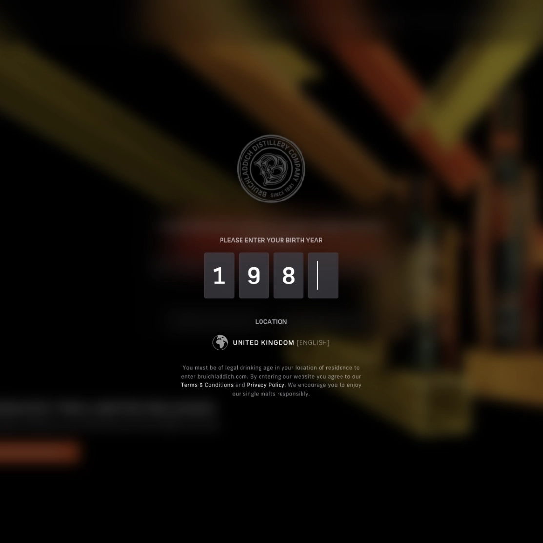
Designing for compliance without breaking premium feel.
Every restriction was treated as a design opportunity rather than a legal pop-up. This compliance work is rarely visible in case studies, but it is one of the things hiring managers in this category care about most. It is where the work shipped.
Alcohol direct-to-consumer is one of the most regulated categories online. Age verification varies by territory. Geographic restrictions block sales into entire jurisdictions. Advertising standards constrain language around health claims, social proof and gift positioning. Shipping is restricted to specific countries, with specific carriers and paperwork.
Compliance done badly breaks the brand. A bureaucratic age gate undermines the premium first impression. A geo-block message that reads like a 404 alienates customers in restricted markets.
I designed age-gating and geo messaging as part of the brand: full-bleed imagery, the typography of the site, copy in brand voice rather than legal voice. Every restriction was a design opportunity. The work shipped to every market the brand sells in.
09 / Engineering for the rush
Releases that do not crash the site.
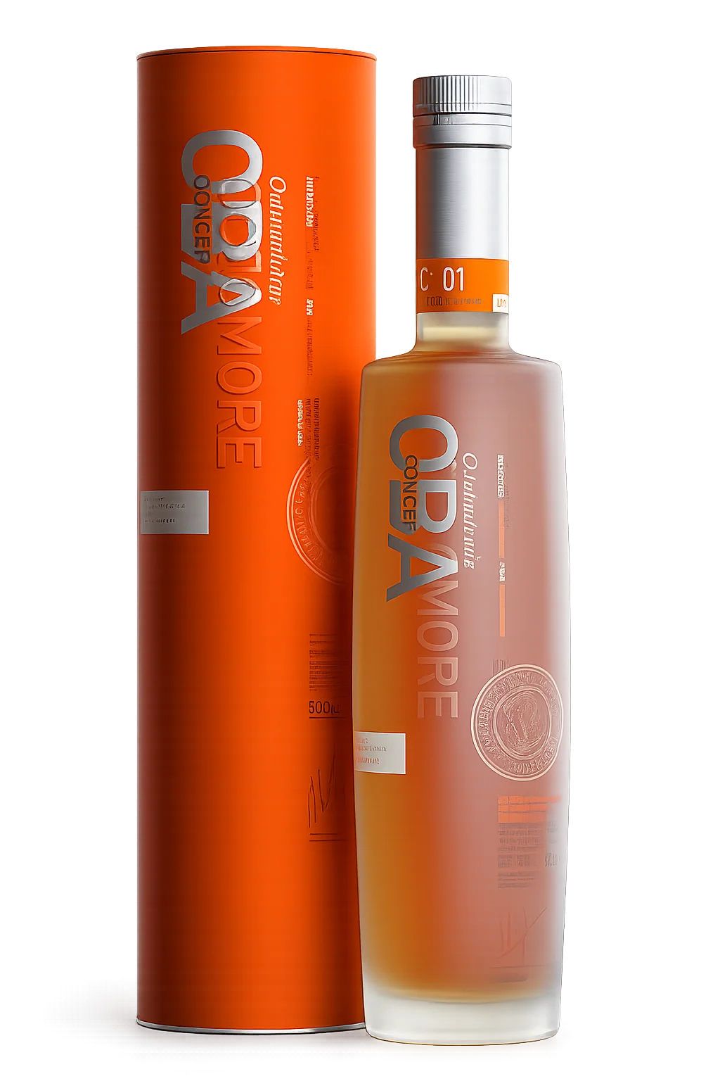
Limited-edition Octomore Black Art releases generate the kind of traffic that takes ecommerce sites down. The site had this problem more than once in the early years. The fix was a coordinated approach across platform configuration, image and video optimisation, queue-based release pages, and a shipping carrier handoff that could absorb a surge.
I worked with our external developer to build resilience into release flows, and made the design decisions that supported it: pre-launch holding pages, simplified add-to-cart paths, deliberate constraints. By the end of my tenure a launch could do close to a year’s worth of sales in a single afternoon without the site falling over.
10 / Outcome
Tenfold growth, brand intact.
Across the nine years, direct sales from bruichladdich.com grew by approximately tenfold from a small starting base. Specific figures are constrained by Rémy Cointreau group disclosure rules; the directional shape of the growth is what matters. A niche distillery’s website became a meaningful direct revenue channel without becoming a transactional site.
The work is still live. The architecture, brand voice and commerce patterns now in place at bruichladdich.com are the ones I designed and shipped. The site continues to evolve under the team that inherited it.