Concept · 3D Commerce
What does an ultra-premium spirits PDP look like when 3D is treated as a system, not a flourish?
A reframing of The Macklowe's listing and detail pages, built around what photography can't communicate: the difference between a $69 bottle and a $1,500 one.
01 / Brand & Brief
The Macklowe – American Whiskey
The Macklowe is a New York-founded American Whiskey brand led by Julie Macklowe, a globally certified Whiskey Ambassador. The range spans four labels at sharply tiered price points: Red Label Bourbon at $69, Silver Label Rye at $98, Gold Label Single Malt at $298, and Black Label, a 13-year single cask release, at $1,500.
The commercial proposition is small-batch and member-led: limited releases across the four tiers, a member-only Collective who receive early-access notifications before public release, and the language of single-cask scarcity at the top of the range.
The brief I set myself: treat the four-bottle range as a premium DTC system and rebuild the listing and detail pages with 3D as the primary product surface, not a supplementary widget.
The argument tested: at this price tier, the PDP is the moment of doubt. A buyer hovering over a $1,500 bottle needs more than four product photos and a tasting note. They need the object to feel categorically different from the $69 bottle two clicks away. Static photography plateaus before that case is made. 3D, properly used, is one of the few things that can make the difference between Red and Black feel as material as the difference in price.
02 / Hypothesis
The case for 3D as a system
Premium spirits brands have a structural problem with photography. The product is a cylindrical glass object, and four cylindrical glass objects photographed under the same lighting look more alike than they should. The price ladder runs from $69 to $1,500, but the visual ladder collapses to a row of near-identical silhouettes differentiated by label colour.
This matters commercially because the price ladder only works if the higher tier feels categorically different from the lower one. A buyer considering Black Label at $1,500 is comparing it not just to other whiskies but to the same brand’s $298 bottle, and asking why the gap is what it is. The PDP is the moment that question gets answered or doesn’t.
The argument I tested across this work: 3D earns its place on a premium spirits site when it does three things photography can’t.
03 / The Artefact
The system, applied
The system lives in two pages: a PLP and a PDP, both treating 3D as the primary product surface. On the PLP, rotation reveals a second face of each bottle. On the PDP, rotation reveals craft.
Block A — PLP capture
On the PLP, the four-label range reads as a curated set. Hovering a bottle rotates it to reveal a short product description as animated text on the back, doing the job category labels and prices do on a standard catalogue grid.
Block B — PDP capture – Responsive view
The rotate is the gallery
Every visible element on the page earns its place against the rotate. Title, age statement and tasting notes sit alongside the bottle rather than below it, so the eye never has to leave the object. Volume and ABV consolidate into a single line. Add to cart anchors to the lower right of the viewport and stays there on scroll.
What isn’t there matters more. No supplementary photography. No detail gallery. Those exist on standard PDPs to give the customer angles they can’t get themselves. The rotate gives every angle on demand, so the workarounds go.
Block C — Craft detail
Craft lives in the details photography handles worst: foil, deboss, and embossing across the cap, label, glass, and base.
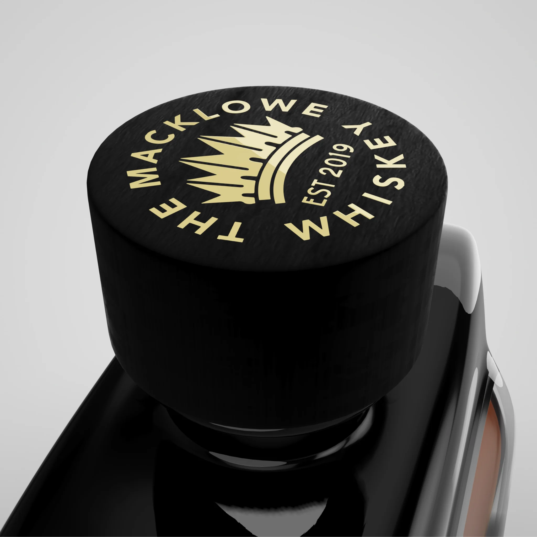
Cap
Foil-stamped insignia on matte black wood
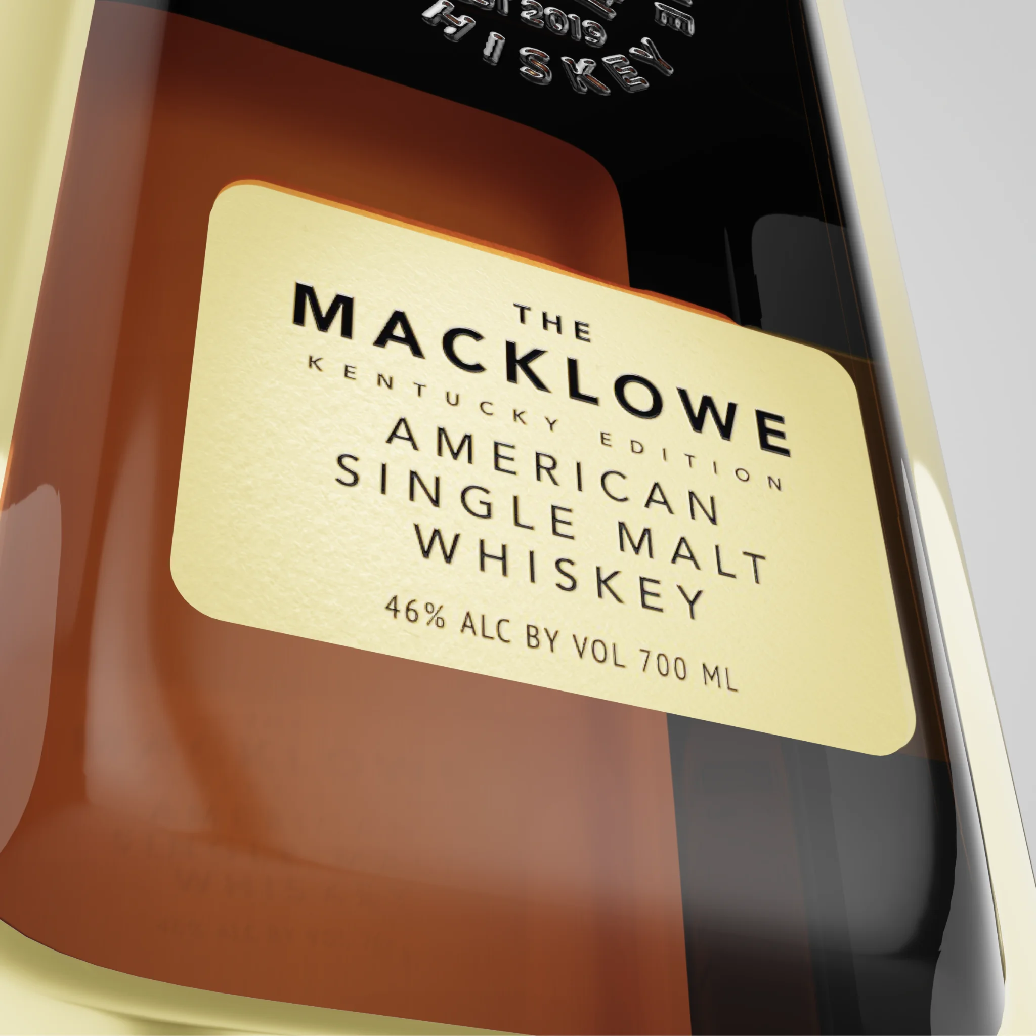
Label
Hot-foil typography on felt paper
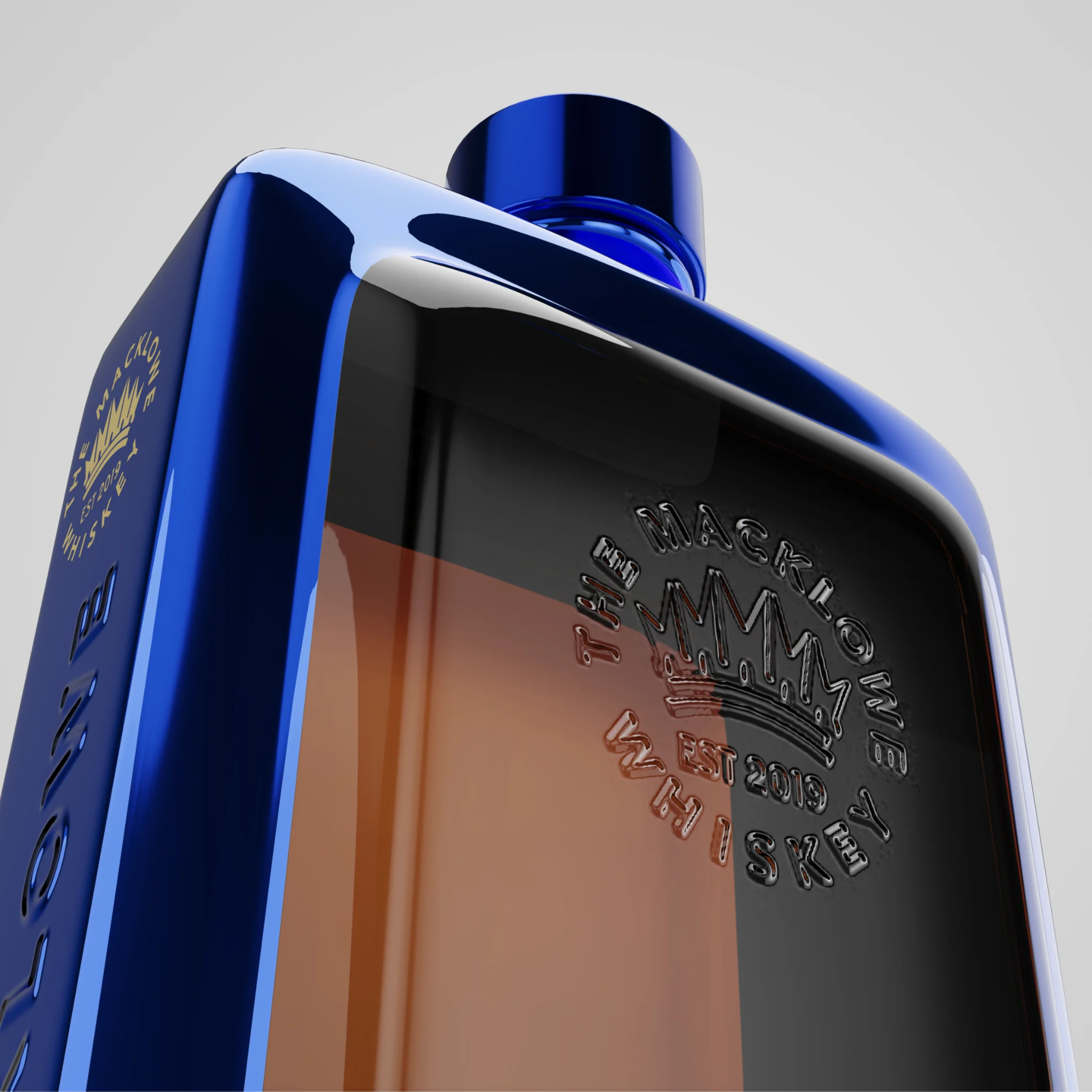
Glass
Debossed brand seal on flint glass
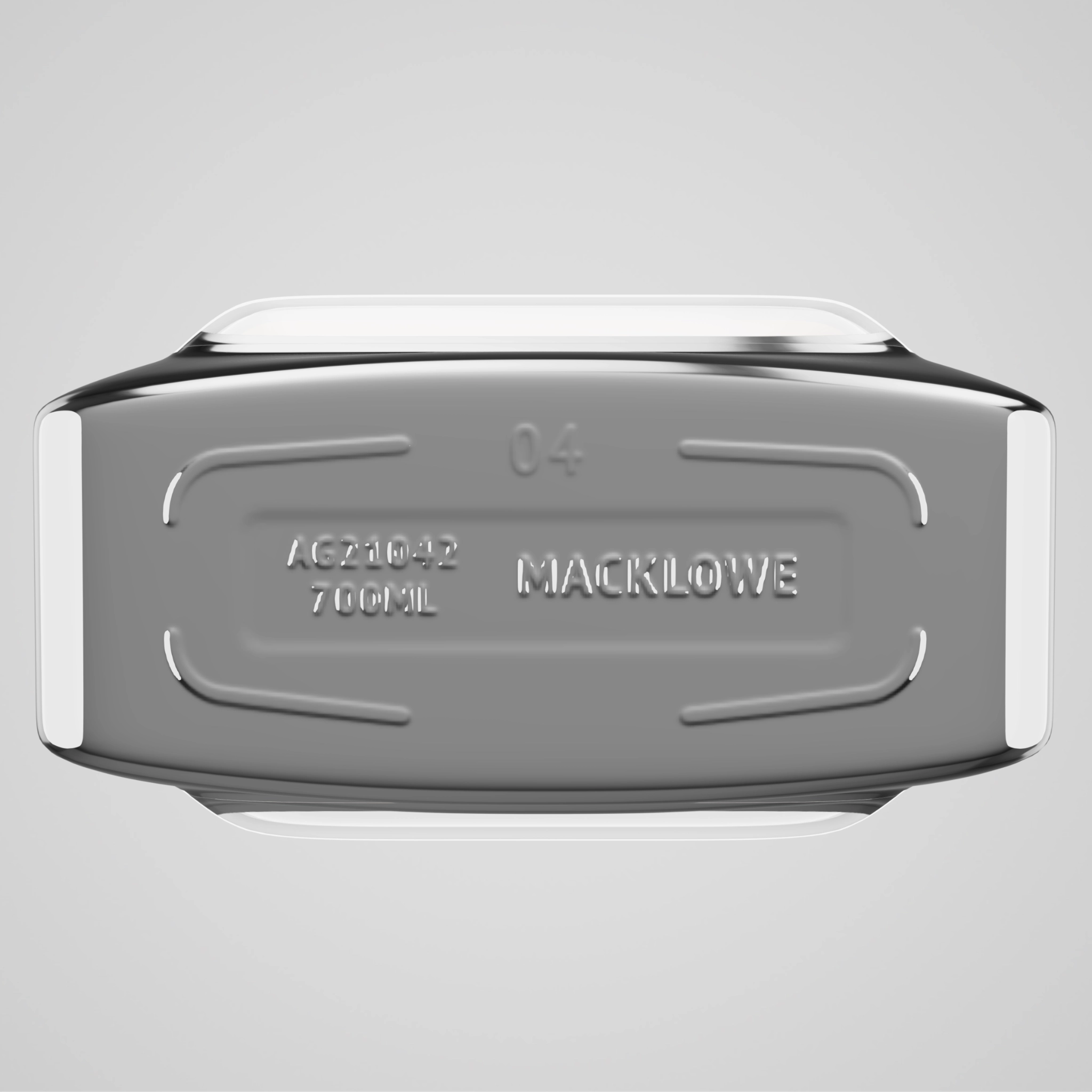
Base
Recessed brand mark within raised footing
What I decided, and what I traded off
Most product 3D on the web fails for the same reason: it’s treated as a feature, not a set of decisions. Each choice below had a credible alternative. I’ve noted what I chose, and what I gave up.
-
01
Neutral studio, not contextual
A bar or distillery setting would have placed the bottle in a story. I chose neutral because the buyer is on a product page, not in a brand film. Atmosphere belongs further up the page; here, the object leads.
-
02
Slightly elevated camera
Eye-level reads as documentary. Below reads as monumental. A few degrees above is the angle a buyer would naturally hold the bottle, and it catches the top of the liquid where Fresnel reflection makes the whiskey look wet.
-
03
Drag to rotate, no instruction
A “drag me” tooltip would have made the affordance explicit. The cursor changes on hover, the bottle has visible roundness, and anyone who has used a 3D configurator will try a drag instinctively. Affordance through form.
-
04
Variant switching as a hard cut
A morph between Red and Black would have been impressive. It would also have been wrong. These are different products, not states of one. A hard cut respects that; camera and lighting hold so the eye can compare.
-
05
Label off-axis by default
A front-on view shows the most label, which is what photography already does. Setting the default slightly off-axis shows both label and bottle profile in the first frame. That contrast is what 3D is for.
05 / Tool Choice
Why Vectary, and what would change for production
I built the proof of concept in Vectary. It was the right tool for this stage of the work and the wrong tool for the next one.
What Vectary did well: browser-based PBR materials with credible refraction, transmission, and volumetric absorption out of the box. For modelling the relationship between liquid IOR, glass thickness, and absorbed amber light, the visual editor was faster than any code-first route. The pitch deck and the case study captures both came out of Vectary’s renderer.
Where Vectary would not have shipped this to production: the embed renderer is a different beast from the editor preview. Materials read flatter, environment lighting is reduced, and there’s no control over loading strategy, accessibility, or analytics. For a portfolio piece this is acceptable; for a live commerce surface on a $1,500 bottle, it isn’t.
What I considered: Spline was rejected on material fidelity for refractive surfaces. PlayCanvas was the strongest visual-builder alternative, with a proper scene editor and better runtime control, but its strategic shift toward AR following Snap’s acquisition makes it a less safe long-term bet for non-AR commerce work. Babylon.js is technically excellent and I’ve used it before, but the visual-builder advantage that justified moving off Vectary doesn’t exist there.
Where I’d take this for production: Three.js with React Three Fiber, hosted directly on the brand site. MeshTransmissionMaterial for the glass and liquid, custom HDRI for the environment, lazy-loading per variant, and a still fallback for low-end devices. The bottle embedded live above is a step in that direction, served via the model-viewer web component as an honest middle ground between Vectary’s embed and a full Three.js rebuild.
06 / Constraints
Three honest gaps
Three things this work doesn’t yet do, and what would change for production.
OneNo live commerce integration
The PLP and PDP are visual rebuilds, not functional ones. Add to basket, Macklowe Collective member-access logic, and the regulatory complexity of state-by-state alcohol shipping all sit outside this work. A production version would lead with those, not follow them.
TwoAccessibility was not the priority
A 3D-led product page can be made accessible, but it takes deliberate work: keyboard rotation controls, screen-reader-announced variant changes, a reduced-motion fallback that swaps the rotate for stills, and proper alt text on every visual surface. None of that is in the proof of concept. For a real launch it would be in the brief from day one.
ThreeNo analytics, no testing plan
A premium DTC client would reasonably ask whether 3D actually moves conversion at this price tier, or whether it just looks expensive. The honest answer is that I don’t know, and the only way to know is to A/B test it. A production scope would include a measurement plan, not just a design.
What I’d do differently if I started again: lead with the felt paper. The label is the most distinctive thing about the bottle and the thing photography handles worst. The current rebuild treats the label as one element among many. A second pass would treat it as the primary content, with the bottle as the carrier for it.
07 / Status
Pitched, paused, expanded
I pitched this concept to The Macklowe’s founder, Julie Macklowe, in 2025. She engaged with the work but the brand wasn’t in a position to commit capital to a rebuild at that stage. I rebuilt and expanded the work in 2026, including the newer Red Label Bourbon, as a more complete demonstration of the argument.
The case study is the project’s current home. I’m open to revisiting it as a production build if the brand returns to the conversation, and to applying the same approach to other premium DTC clients in regulated categories where photography is doing too much of the work.